
PTE Describe Image – Describe image is one of the challenging tasks in PTE speaking. You are required to describe image – the important information in a graph, a series of graphs, a table, a map, a process, an image or picture. Please look at the image for 25 seconds and describe it in 40 seconds. Write your own answers in the comment section. The sample answers will be provided after each question.
Describe Image PTE Sample with Answers

PTE Describe Image
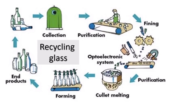
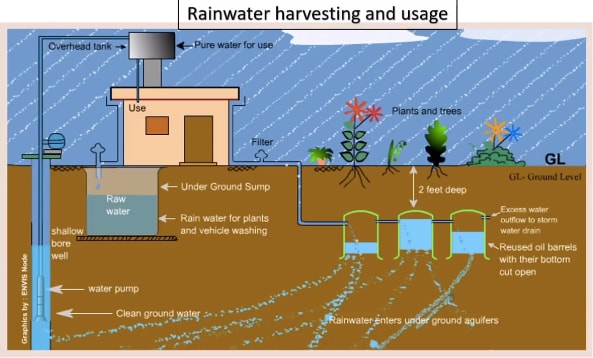
Describe Image PTE Practice Question 1
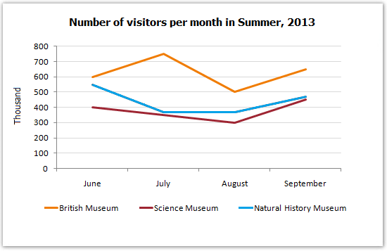
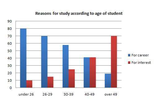
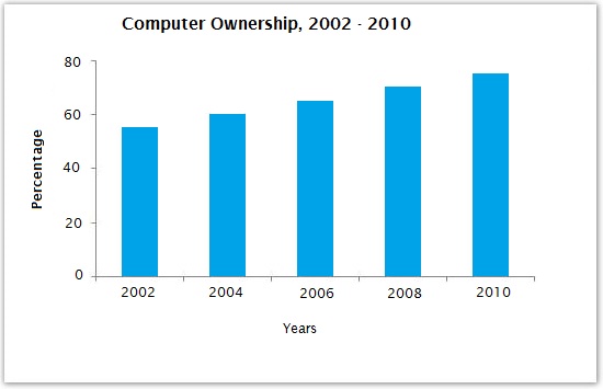
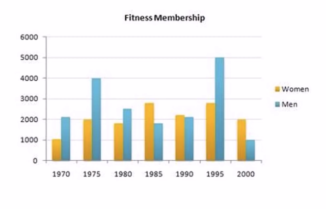
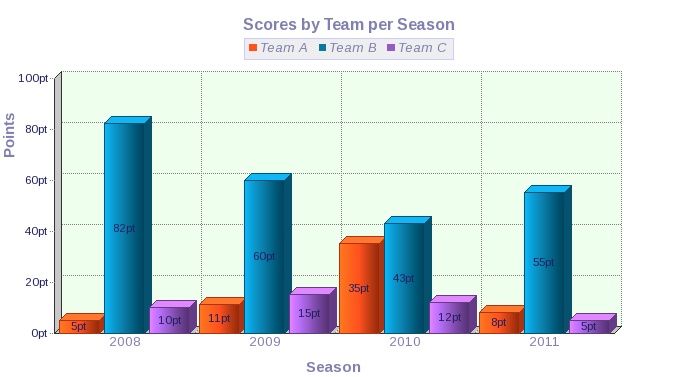
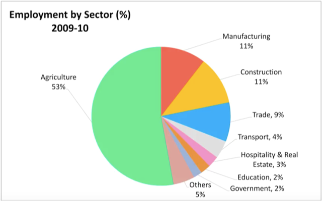
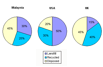
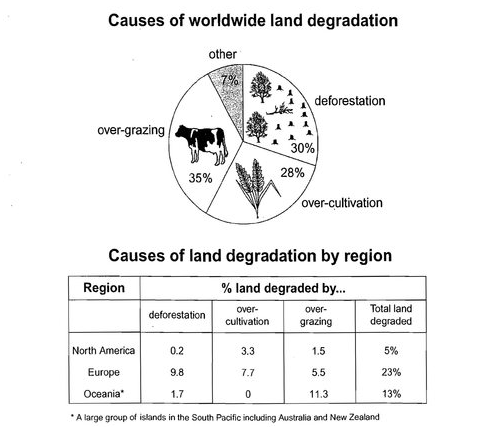
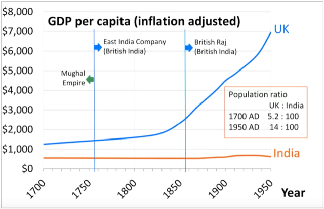
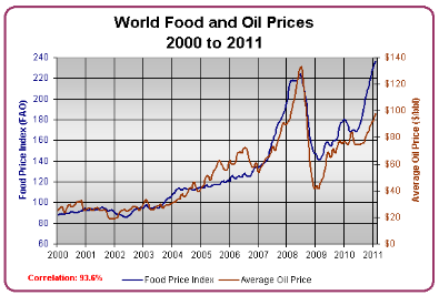
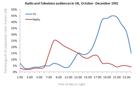
Describe Image Answer 1 Describe Image Answer 2 Describe Image Answer 3 Describe Image Answer 4 Describe Image Answer 5 Describe Image Answer 6 Describe Image Answer 7 Describe Image Answer 8 Describe Image Answer 9 Describe Image Answer 10 The bar graph shows the information about computer ownership by different level of education from 2002 to 2010 measured in percentage. The highest computer ownership was recorded for postgraduate students that were 70% and 90% in 2002 and 2010 respectively followed by the percentage of ownership for bachelor’s degree students. On the other hand, the least ownership was recorded for those students who had no high school diploma. To conclude, computer ownership was increased by the increased of level of education. The bar graph represents the information about fitness membership owned by both of the genders from 1970 to 2000. In 1970, 2000 men and 1000 women registered for fitness membership which doubled its value in 1975 for both of the genders. In 1990, the marginal difference can be seen in between females and males. In 1995, the highest membership registered by men and women that 5000 and approximately 3000 but in 2000, membership by men and women recorded irreversibly proportionate to membership in 1970. The bar chart shows the scores of three teams, A, B, and C, in four different seasons. In the season 2008, the highest score was found by Team B that 80 points as compared to others Teams but declined to 40 points in the season 2010. On the other hand, Team A had highest scores in the season 2010 that was approximately 35 points and Team C scores remained below 20 points throughout a given period. To conclude, Team B had always higher points. The pie chart shows the employment provided by various sectors in 2009-2010 for a particular region, maybe a state or a country. It is very clear from the chart that biggest employment provider in 2009-2010 was agriculture accounting for more than 50% of the share. This is followed by Manufacturing and Construction each providing 11% of total jobs in the region. The next highest was Trade sector at 9%. Transport and Hospitality and Real Estate came in next at 4% and 3% respectively. Education and Government provided only 2% and all other sectors combined accounted for the remaining 5%. It is clear that agriculture is the mainstay of this region. The three pie charts depict the information about the distribution of land by different means in three different countries; Malaysia, USA and UK. It can be seen that 45% of land used for disposing of material in Malaysia followed by area used for landfill and recycled. In USA, half of the area is used for Landfill and least area is used for disposed off that was 20%. In UK, the Highest proportion of the area is used for disposed whereas the least percentage is used for landfill. The pie chart shows causes of worldwide land degradation measured in percentage and table shows causes of land degradation by different regions measured in percentage. From Pie chart, the highest percentage comes from over-grazing that is 35% followed by the percentage of degradation comes from 30% where least land is used for over-cultivation. From table, In Europe, highest percentage is used for deforestation that is 9.8% whereas in Oceania, the highest land is used for Over-grazing and no land is used for over-cultivating. North America is used least land among others for degradation. The graph compares the GDP per capita of India and UK from 1700 to 1950. The GDP has been adjusted for inflation. It is interesting to note that while India’s GDP remained constant from 1700 to 1950 at around $500, the GDP of UK increased steadily from the time of East India Company starting in 1750 and sharply after 1850 when the British Raj was established. By 1950 UK’s GDP was around 14 times that of India. At the same time, the population ratio of UK and India changed from almost 1.20 in the 1700s to almost 1:7 in 1950. The line graph shows world food and oil prices measured in points and barrels from the year 2000 to 2011. In 2000, food price was approximately 90 and after fluctuations, it increased to 220 points in the year 2008 then further increased to its highest point that was approximately 240 points in 2011. On the other hand, in 2000, the oil price was more than food price and increased to its highest price in 2008 that was $120 per barrel then declined to $100 per barrel in 2011. The line graph shows the information about Radio and Television audiences in the UK in October to December 1992 measured in percentage. At 1.00 am, more than 5% people started to watch TV which increased to approximately 15% at 13.00pm and further increased to 45% at 21.00pm then drop to 15% at night 23.00. On the other hand, 25% of people liked to listen to Radio at 8.00 in the morning whereas this trend declined to approximately 5% at night 23.00. To conclude, it can be said that watching TV and listening radio both were irreversibly proportionate to each other. The line graph shows the number of visitors per month in summer measured in thousands to watch different Museums in 2013 from June to September. In June, the highest visitors were found in British Museum which increased to more than 700. In July then declined in the month of September followed by the number of visitors were recorded in Natural History Museum that ranging between 400 to 600 for a given period. On the other hand, 400 visitors went to Science Museum in June which decline to its least value that was 300 in August and reached to its highest value in September. To conclude, British Museum was famous among others.Describe Image PTE Practice Question 2
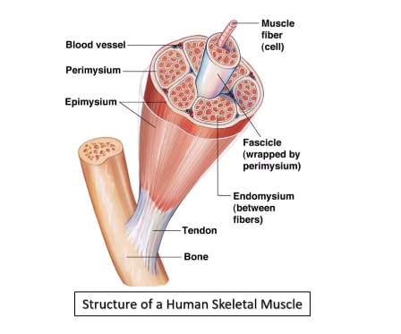
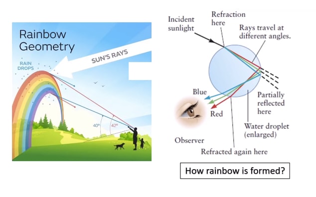
Describe Image PTE Practice Question 3
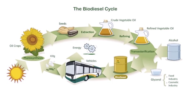
Describe Image PTE Practice Question 4

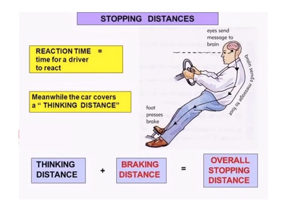
Describe Image PTE Practice Question 5
Describe Image PTE Practice Question 6
Describe Image PTE Practice Question 7
Describe Image PTE Practice Question 8
Describe Image PTE Practice Question 9
Describe Image PTE Practice Question 10
Describe Image PTE Practice Question 11 – Bar Graph
Describe Image PTE Practice Question 12 – Bar Graph
Describe Image PTE Practice Question 13 – Bar Graph
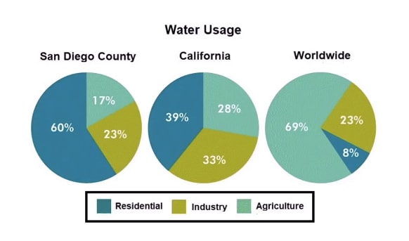
Describe Image PTE Practice Question 14 – Pie-Chart
Describe Image PTE Practice Question 15 – Pie Chart
Describe Image PTE Practice Question 16 – Pie Chart
Describe Image PTE Practice Question 17 – Line Graph
Describe Image PTE Practice Question 18 – Line Graphs
Describe Image Practice Question 19 – PTE Line Graph
Describe Images Practice Question 20 – PTE Line Graph